YouTube Music Red Logo on Google TV [2026]: 1 Icon
What changed in the YouTube app on Google TV · What stays the same inside the Music tab · Rollout status: what the report confirms and what it skips · Why one colored icon pulls the eye · Why the change may not stay on Google TV · A steady run of YouTube interface changes · Music inside a video app versus a standalone service · What it means for creators and music video uploaders · A design lesson for logo and intro work · How to check whether your TV shows the red icon · Reader reaction and what the report leaves out · Predictions: where the red logo goes next · The takeaway · Common questions
YouTube Music now has a bright red logo in the sidebar of the YouTube app on Google TV, and the first reaction has been sour. 9to5Google reported on October 30, 2026 that YouTube is rolling out, or at least testing, an update that swaps the old icon for a red one. Senior editor Ben Schoon called the new logo distracting and said he hopes YouTube takes it back.
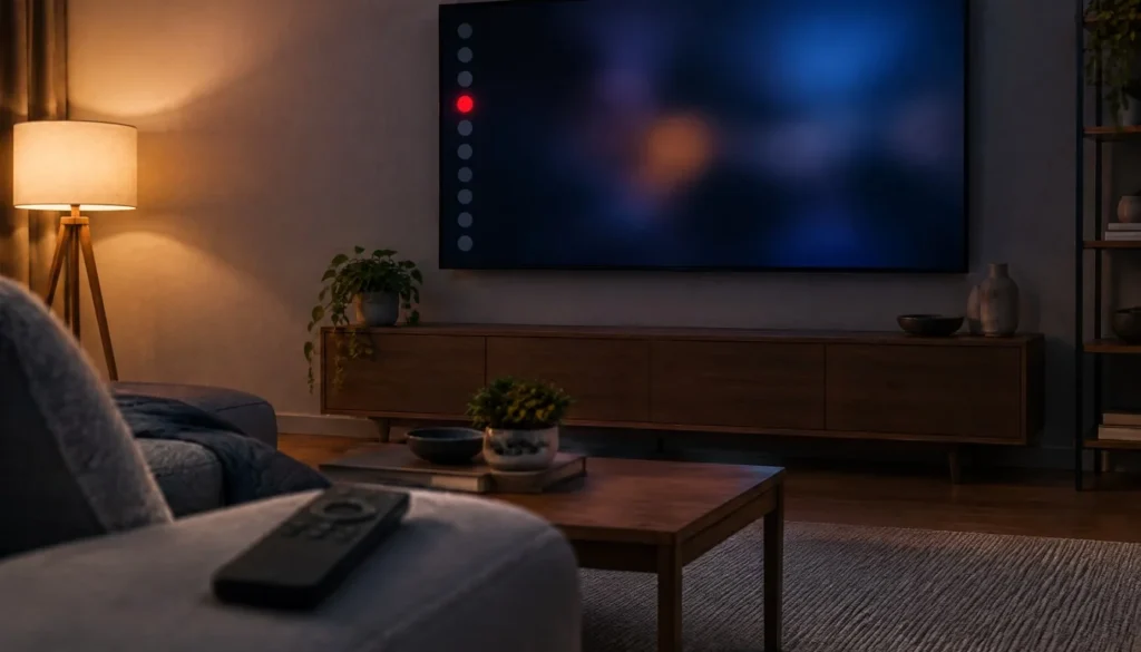
The red logo is now the only colored icon in that sidebar, which is why it jumps out. The Music tab itself is unchanged. It still shows music videos and content from artists you have listened to or follow. This is a branding and layout tweak, not a new feature.
For creators, the practical read is short. Nothing in upload rules, export settings or YouTube thumbnail size changes because of an icon. But how YouTube frames music inside its TV app affects where music video viewers look, so it is worth understanding. Below is what the report says, what it leaves out, and what we can reasonably infer.
What changed in the YouTube app on Google TV
The change sits in the navigation strip along the side of the YouTube app. Per 9to5Google, the YouTube Music entry used to look like its neighbors. Now it carries a bright red logo, and no other icon in the strip has color.
Schoon compared the new look with a screenshot of the previous interface at the top of his story. His verdict was that the red logo stands out far more than before. He described the update as subtle on paper, yet said it does not feel subtle on screen. That fits how a single saturated element behaves among muted ones.
He also noted that YouTube’s TV interface changes now and then with little warning. This update fits that pattern. YouTube published no announcement that 9to5Google cites, so the report rests on what the app shows on Google TV devices.
What stays the same inside the Music tab
Open the Music tab and nothing new greets you, according to the report. It still lists music videos and content tied to artists you have listened to or follow. The red logo changes the doorway, not the room.
That matters for anyone asking whether the update is a signal of something bigger. The report mentions no new playback features, no pricing change and no change to plans. It describes an icon swap and nothing more. If YouTube has a larger music push planned for TV, this report does not say so, and we should not read one into a logo.
It also means viewers who ignore the Music tab lose nothing and gain nothing. The visual noise is the only cost, and that is a matter of taste. One top reader comment under the story actually liked the change, saying it makes the music service look like a first-rate app instead of a video category. Taste, in other words, splits both ways.
Rollout status: what the report confirms and what it skips
The honest summary is that the rollout state is unclear. 9to5Google wrote that YouTube is rolling out the update or at least testing it. That wording matters. A test can reach a slice of users, change, or vanish. A full rollout stays. The report cannot tell us which one this is.
| Detail | What 9to5Google reports |
|---|---|
| Date of report | October 30, 2026 |
| Author | Ben Schoon, senior editor |
| Where it appears | YouTube app on Google TV |
| The change | Music sidebar icon replaced with a bright red logo |
| Rollout state | Rolling out, or at least testing |
| Other colored sidebar icons | None, the red logo is the only one |
| Music tab content | Unchanged |
| Other platforms | Possible, since the TV app design is shared across platforms |
| YouTube statement | None cited in the report |
| App version, device list, region | Not stated |
The last two rows are the gaps. No app version is named, no list of devices, and no country. So if your TV does not show the red icon today, that tells you nothing about whether it will tomorrow.
Why one colored icon pulls the eye
Interface designers have a simple rule: the one thing that differs wins attention. Put one red mark in a column of neutral icons and viewers look there first, whether or not that is the item you want them to find. This section is analysis, not reporting, but it explains why a small swap produced a loud reaction.
Color competes with the focus highlight
TV apps run on a remote, so the item you are about to select is usually marked with a highlight. A permanent bright color on one entry competes with that highlight. When you scroll down the sidebar, your eye gets two signals at once: where the cursor is, and where the red logo sits.
A brand mark behaves differently from a navigation icon
A navigation icon says “go here.” A brand mark says “this is a distinct product.” Using the brand mark as the navigation icon blends the two jobs. YouTube may want the second message, which is that the music service is its own thing inside the video app. The cost is a sidebar that no longer reads as one consistent set.
There is a counter-argument. A bright mark can also work as a landmark. Some viewers scan a sidebar by shape and color, and a red logo is easy to find from the couch. That is probably what the reader who liked the change meant. Whether the gain in findability outweighs the loss in visual calm depends on how often you open the Music tab. Heavy users may welcome the shortcut for the eye. Everyone else just sees a red dot they never asked for.
Why the change may not stay on Google TV
Schoon pointed out that YouTube’s TV app design is shared across multiple platforms. His read is that the red logo could show up beyond Google TV. The report names no other platform, so treat that as a possibility and not a schedule.
Shared design systems work this way. A team updates the TV interface once, and the update flows to every device that runs the same app layer, sometimes in stages. If you own a smart TV, a streaming stick and a game console, check each one. They may not match for a while.
There is a flip side. A test confined to one platform is easier to pull back. If feedback is loud enough, YouTube can end it before it spreads. Given that 9to5Google framed this as a rollout or a test, both outcomes stay open.
A steady run of YouTube interface changes
The red logo does not arrive alone. The “More on YouTube” list at the bottom of the same 9to5Google story links to other recent coverage of the platform, and it shows how often YouTube adjusts the surfaces people touch every day. The table below lists only what those headlines say, with no added detail.
| Item | Surface | How 9to5Google framed it |
|---|---|---|
| YouTube Music sidebar icon | Google TV | Replaced with a bright red logo, rolling out or in testing |
| Subscriptions tab | Android and iOS bottom bar | YouTube removing it after nearly a decade |
| Dislike button | YouTube | YouTube says it is not hiding it |
| Audiobooks | YouTube Premium | YouTube reportedly looking into adding them |
| Reader reaction to the red logo | Google TV | Mixed, the author disliked it and a top comment liked it |
Taken together, the headlines describe a company that keeps reshuffling navigation. Removing a bottom bar tab used for nearly a decade is a bigger structural move than recoloring an icon, yet both reflect the same habit of testing layout on a live audience. For the wider category, see our pillar page on platform video specs.
Music inside a video app versus a standalone service
The red logo highlights a design choice that every large video platform faces. Either music lives as one tab among many, or it gets its own identity. YouTube has long done a bit of both, with a dedicated music service that still shares an app shell on TVs.
Before this update, the sidebar treated music as one more entry. After it, music looks like a separate brand parked inside the video app. Standalone music services avoid the question entirely because the whole app is the brand. The sidebar approach forces a trade: more visibility for music, less visual unity for everything else.
We have no verified figures on how many Google TV viewers use the Music tab, and the report offers none. So we cannot say whether the extra visibility pays off. What we can say is that the choice is deliberate in effect, even if we do not know the intent.
A fair question is whether this hints at where YouTube wants viewers to spend time. The report offers no evidence either way, and a logo swap alone proves little. Companies recolor icons for many reasons, from brand consistency to simple experiments. Until YouTube explains, treat any claim about strategy as guesswork, including ours.
What it means for creators and music video uploaders
Start with the answer: nothing in your export settings, resolution or file format depends on this icon. The change lives in the viewer’s navigation, not in the video pipeline.
If you publish music videos, the Music tab still surfaces music videos and content from artists viewers follow, per the report. That means the usual levers stay the same: a clear title, a strong thumbnail and consistent uploads so your channel sits in a viewer’s followed list. A bolder entry point could send more TV viewers into the Music tab, though the report gives no data to confirm it.
One habit is worth building. Open your own channel on a TV at least once a month. Thumbnails that look sharp on a laptop can read poorly from across a room, and TV interface changes like this one are a reminder that the living-room view is a separate test. Do not redesign anything over one icon. Do check how your work looks where your audience actually watches.
A design lesson for logo and intro work
The sidebar is a free lesson in restraint. One saturated color works because everything around it is quiet. The moment several elements compete, none of them wins.
The same logic applies to channel intros and logo stings. If your mark is the star of the shot, keep the background neutral and let one color carry the brand. When you build a reveal, our walkthrough on how to animate a logo covers the prep steps that keep a mark readable. Ask a simple question of every frame: what is the one thing I want seen first?
YouTube’s red logo may fail that test in its sidebar, since the viewer did not choose to look at it. In your own intro, you choose. That control is the whole point of designing the shot.
How to check whether your TV shows the red icon
You can confirm this in under a minute. The steps below use only what the report describes.
- Open the YouTube app on your Google TV.
- Look at the navigation strip along the side of the screen.
- Find the YouTube Music entry and check whether its logo is bright red while the other icons stay uncolored.
- Open the Music tab and confirm it still shows music videos and content from artists you follow.
- Check your TV’s app store for an available YouTube update, then reopen the app.
Keep your expectations modest. Since 9to5Google described the change as a rollout or a test, installing the latest version may not flip it on. Likewise, if you see it today, it may disappear later. The report mentions no setting that lets you switch the icon back, so do not expect a toggle.
Reader reaction and what the report leaves out
Reaction so far splits along taste. Schoon closed his story by asking readers what they think, and said he hopes YouTube reverses the change. A top reader comment took the opposite side and welcomed the bolder look.
Several details remain unreported. The story names no app version, no device list and no region. It cites no YouTube statement, so we do not know whether the company calls this a test, a permanent redesign or a mistake. It also does not say whether the same icon appears in the YouTube app on other TV platforms today.
That is why this article sticks to the report and labels everything else as analysis. A single 9to5Google story, rather than a company post, is the only source on the record. Until YouTube comments or more outlets confirm details, the safe position is the cautious one the original report took.
Predictions: where the red logo goes next
These are our judgments, not reported facts, and none has a date attached.
- The icon spreads if it is a rollout. Because the TV app design is shared across platforms, other TV devices are the likeliest next stop.
- YouTube stays quiet. The report notes that TV interface changes often arrive with little warning, so a formal announcement looks unlikely.
- Feedback decides the test. If the change is an experiment, loud complaints could end it. If it is permanent, complaints will fade as viewers adapt.
- The Music tab itself changes later, not now. The icon swap is separate from the tab’s content, and any deeper music work would show up as new features first.
The takeaway
The takeaway: this is a small visual change with a big reaction, and the facts are thin. 9to5Google reports a bright red YouTube Music logo in the Google TV sidebar, the only colored icon there, with the Music tab untouched. The rollout is unconfirmed, the platforms are unknown, and YouTube has not commented in the report.
For creators, nothing in your workflow moves. Keep checking your channel on a TV, keep your thumbnails readable at a distance, and watch for a YouTube statement before assuming the red icon is permanent.
Common questions
What changed in the YouTube app on Google TV?
According to 9to5Google, the YouTube Music icon in the side navigation was replaced with a bright red logo. It is the only colored icon in that sidebar.
Is the red logo a full rollout or a test?
The report says YouTube is rolling it out or at least testing it. It does not say which, and it names no version or device list.
Did the Music tab itself change?
No. The tab still shows music videos and content from artists you have listened to or follow.
Will the change reach phones, tablets or other TVs?
It might reach other TV platforms. 9to5Google noted that YouTube’s TV app design is shared across multiple platforms, but the report confirms no other device.
Can I turn the red logo off?
The report mentions no setting for it. Nothing suggests a toggle exists.
Does this affect my video upload settings or export format?
No. The change is in how viewers navigate the TV app. It does not touch resolution, codec or any upload requirement.
Has YouTube commented on the new icon?
The 9to5Google report cites no YouTube statement. Check the company’s official channels for any later word.
- Vipid intro themes resolution, length and frame rate per theme
- Promo themes product and channel promos
- Sample videos finished Vipid intros
- Vipid intro maker make a custom intro in the browser
Jonah Reyes
Jonah Reyes is the Editing & Export Editor at Vipid. He covers editing software, export settings and codecs, and the video specs of YouTube, Shorts, TikTok and Reels, plus OBS and screen recording. He builds Vipid’s spec tables from the platforms’ own documentation and re-checks them every 60 to 90 days, so the numbers in a guide match what the upload dialog actually accepts.